We have just releaseed VisuMap version 3.5.888. Apart from the new special release number, this version offers the k-NN (k nearest neighbors) classification service. k-NN is kind of a modelless supervised machine learning algorithm, it uses the training data directly as the "model", whereas other classification methods, like SOM (self-organizing net), uses a network trained with the training data as model.
The following short video shows a simple scenario where k-NN is used to match the sphere surface with that of torus:
This post describes a variation of the algorithm Relational Perspective Map (RPM)[1]. The new algorithm, called generalized RPM (gRPM), is more sound from the view point of simulated dynamical system; and produces in general more consistent maps. gRPM has been implemented in VisuMap and has been available since version 2.4. In the following I'll first review the RPM algorithm; then describe gRPM for a special case that employs flat torus topology; I'll then discuss possible variation and extension of the algorithm.
As a MDS (multidimensional scaling) algorithm, RPM seeks to map a set of data points from high dimensional space to the surface of a torus, so that the following "Energy" is minimal:
where δij is the distance matrix between the data points in the high dimensional space; and dij is the distance matrix for the data points on the torus. RPM uses the gradient-descent algorithm to minimize the energy E, so that RPM in effect simulates a multi-particle system to find a minimal energy configuration on the torus directed by the following "force":
The negative sign in above formula indicates that the "particles" exert repulsive force on each other; and the closer two "particles" are on the torus, the larger is the repulsive force. The following picture illustrates the RPM algorithm:
Figure 1: RPM as a mapping algorithm.
In the initial RMP paper, the distance dij is defined as the minimal geodesic distance on the torus surface. This definition leads to a problem that, when two particles are located close to the opposite sites of the torus, the repulsive force between them becomes unstable with alternating directions. The following diagram illustrates this case (where I made the thickness of the torus infinitely small so that the torus becomes in effect a ring):
Figure 2: RPM dynamics anomaly on a ring: the force from A to B+ and B_ have different direction even B+ and B_ can be arbitrarily close to B.
In above diagram, the repulsive force between A and B can quickly change the direction when the particle B moves from position B_ to B+, because the repulsive force follows the minimal path that changed from upper half arc to lower half arc. As will be shown latter, this kind of discontinuity can lead to unwanted artifacts in the resulting RPM maps.
In order to fix the discontinuity problem described above, the gRPM algorithm extends the interaction between two particles to multiple paths between them. In the case of ring topology, gRPM defines the interaction between two particles as superposition of two forces: one along the upper arc and one along the lower arc in above picture. By this definition, when two particles are at exact opposite positions, A and B, on the ring, the two paths between them (i.e. the two arcs) will have equal length, so that the two forces will have equal absolute value but opposite direction. Thus, the two forces will cancel out each other; and the two particles can stay stably at the position A and B.
Formally, let's represent the ring by the numbers in the interval [0, w], where w is the length of the ring; let i and j be two data points mapped to the position x and y in [0, w]. With this representation the two ending points at 0 and w, as shown in the following picture, should be considered as stuck together:
Figure 3: Interval representation of a ring topology.
Then the force between i and j according RPM will be:
The energy and force between i and j according gRPM will be:
We can easily verify that Fij, as a function of x and y, is not continues when |x-y|=w/2. But, F*ij is continues and has the value 0 when |x-y|=w/2.
For two dimensional torus, there will be 4 different paths connecting any two different points on the torus surface. The four paths are illustrated in the following picture:
Figure 4: Four paths between two points on a flat torus. Opposite edge of the rectangle should be consided stuck together.
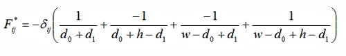
Let (x0, x1) and (y0, y1)be the coordinate of two data points i and j, d0:=|x0-y0|, d1:=|x1-y1|; then the energy and force between the two points are:
The consts w and h in above equation are the width and length of the flat torus respectively.
To compare gRPM with RPM we have applied both algorithms to the sphere data set. The following pictures show the result:
Figure 5: Mapping 1000 data points sampled from a sphere surface to the flat torus: a) The original dataset displayed as scatter plot in the 3D sphace. b) The map generated by the RPM algorithm. c) The map generated by the gRPM algorithm.
We notice that there is kind of framing effect in the map generated by RPM algorithm: high concentration of data points along the boundary of the two square fragments. The map generated by gRPM does not suffer from such framing effect.
The key technique to move RPM to gRPM is to find a set of "conjugated" paths, so the forces induced by them will cancel each out at those "discontinuous" configurations of RPM. With this technique we have worked out gRPM algorithm for other relatively simple spaces (e.g. 2D smooth manifolds). In VisuMap we have implemented gRPM for flat klein-bottle, flat sphere, flat real projective plane (all flat fundamental polygons), 3D sphere and the projective plane in half-sphere model. The set of conjugated paths for these manifolds comprise 2 to 8 paths.
Discussions:
The initial RPM algorithm defines the energy as 1/dpij, where p is any positive number. Just for the sake of simplicity, we have here just considered the case p=0. The handling of other values for p should be analogous. In fact, for any smooth monotonously increasing function h(x), we can use the function 1/h( dij) as energy function for gRPM.
Notice that, for the ring topology, the two "conjugated" paths form a complete winding loop (see Figure 1.) As an extension, we could require that the path pair forms two winding loops. As shown in the following diagram, two particles will have minimal energy when they are at the same spot (that is the same phase but different loop). Thus, the repulsive force will be effectively turned into attractive force. In general, we can easily verify that, for the ring topology, the interaction is repulsive when the path pair forms odd number of loops; and is attractive when the path pair forms even number of loops. This kind of winding number resemble the spin numbers of bosons and fermions in particle physics. It might be interesting to investigate gRPM for these more general cases.
Visualization of high-dimensional data with relational perspective map, James X. Li, Information Visualization 2004; 3, 49-59.
I have just uploaded a short video to youtube that demonstrates the capability of VisuMap
to visualize large dataset on a dual monitor system. It is the first time that I used a HD
carmcorder to make videos for YouTube. It was a challenge to squeeze the large screen HD pixels to youtube sized videos, I hope the video shows at least some interactive perspectives of the software product.
Principal Component Analysis (PCA) is a widely used method to investigate high dimensional data. Basically, PCA, as a dimensionality reduction method, rotates a data set in the high dimensional space so that it shows most information (i.e. variance) from certain view direction. In this note, I am going to describe a very simple yet effective extension of PCA. The method, which I call Guage PCA (GPCA), works as follows: Instead a of using a single global rotation as in normal PCA, GPCA first decomposes the dataset into multiple clusters, then find a rotation for each clusters; and then compose a global map from the rotated clusters. The following picture illustrates the steps of GPCA:
We can image that above maps illustrate the scenario to take snapshot of a fish tank with 4 different fishes. The top map is a random snapshot in which the fishes face different directions. The middle section are the 4 fishes rotated to show maximal information to the viewer. The last map is a snapshot of the fish tank with all fishes magically rotated, so that each fish shows the maximal information to the viewer. This scenario is sort of an extension of the scenario described in the video "A layman's introduction to principal component analysis".
In certain sense, the relationship of PCA to GPCA is analogous to the relationship between linear regression and linear spline: the former uses a single straight line to approximate a curve, whereas the latter uses multiple line segments. It is obvious that linear spline, as approximation method, is much more powerful than linear regression. The following picture illustrates how linear regression and linear spline approximate a set of points:
A key requirement for linear spline is that the line segments have to be joined together to form a single polyline. Similarly for GPCA, we require that the composed resulting map to preserve variance of the map in major directions. It should be noticed that there are many PCA related approaches under the term localized PCA. Those approaches mostly focus on how to segment the data, but ignore the step to compose a single global map for visualization purpose. In contrast, the composition step in GPCA is the key step. The creation of the initial map and the segmentation of the data is actually not part of the algorithm but just initial conditions.
VisuMap has been supporting GPCA for a while now. In order to use GPCA, we first create a MDS map and cluster the data with any available clustering algorithm of VisuMap; then open the PCA view for a selected cluster and click on the capture button to embed the local PCA map back into to original MDS map. The following video shows the process to create GPCA map for a sample dataset from pharmaceutics :
I have borrowed the term gauge from modern physics in which the gauge principle plays a fundamental role. The gauge principle states that a global system behavior is invariant under local gauge rotation. So for instance, when we calculate orbits of planets in our solar system we don't have to care about the orientation of individual planets. The orientation of planets is an additional freedom that has no impact on structure of orbits. This kind of extra degree of freedom has turned out to be the core structure underlying many laws in modern physics.
When using MDS (multidimensional scaling) maps in the practice, a frequently asked question is how does a particular attribute, i.e. a data column in the input table, impact the resulting MDS map? One simple way to visualize the effect of an attribute is just create another MDS map without that attribute under investigation. The difference between the two maps can be then ascribed to that attribute. For instance, the following two maps are MDS maps (created with CCA aglrotihm) of the VisuMap sample dataset yeast.xvm: the fisrt is created with the first 5 attributes; second one with just the first 4 attributes.
The difference between the two maps above is thus caused by leaving out the fifth attribute (i.e. the attribute spo2). We notice that the two major data point clusters (colored as yellow and cyan) are more separated in the first map. Thus, we can see that the attribute spo2 provides significant separation for these two clusters.
With the VisuMap plugin module ClipRecorder we can do a much better job to visualize the effect of a attribute. The newly released ClipRecorder version 1.2 includes scripts that help users to create a sequence of MDS maps with gradually decreasing weight for a selected attributes. The difference between two successive maps provides direction vectors which indicate how data points move when the weight for the selected attributes decreases. The following map is one of such map that visualizes the movement direction of all data points at certain moment during the running process of the script:
In above map, each bi-colored bar represents a data point; the red side of the bar points to the moving direction of a data point and the length of the bar indicates the speed of the movement.
The ClipRecorder plugin also records all the map sequences, so that we can replay them any time later as simple map animation. The following short video clip, for instance, shows such an animation:
We have just released VisuMap version 3.5.882. Worth mentioning in this release are two enhancements to the scripting interface. The first enhancement is the auto-complete editing. We have added script analyzer to the editor so that it will automatically suggest class members with documentation when it notices that user is about to add code to access class methods or properties. The following shows a screen short of the auto-complete editing:
The second enhancement to the scripting interface is the so-called property spinor: within an editor window the user can now double click a property value to link the property to the mouse wheel. When the mouse-wheel is linked to a particular value in a script and when the user spins the mouse wheel, the property spinor will automatically change the linked value and execute the whole script. With this feature VisuMap provides a very generic control mechanism to probe different settings, so that user can see immediately the consequence of changed settings.
The following is short video to demonstrate the usage of property spinor:
A common question by data clustering is: How stable is the clustering results? It often happens that some data points are classified by an algorithm to a common cluster, but when you run the algorithm again on the same data with slightly different initialization conditions these data points might be classified into different clusters. This phenom seems to be a consequence of the nondeterministic behavior of the algorithm, but it is rather a manifestation of the clustering structure among the data. From certain point of view, these unstable data points tells us actually more interesting information about data than those stable data points.
One way to answer the stability question is using the boosting method (also called ensemble clustering) where we aggregate the results of multiple runs of a clustering algorithm. One of the simplest aggregation method is as following: we classify two points to a common cluster (i.e. assign the same color to two points in a map) if all runs classified the two points to a common cluster.
To visualize the ensemble clustering let us consider a sample as by the following picture. Th picture shows how the k-Mean algorithm clustered a data set in three different runs (i.e. with different random initialization.) When we look closely at these three maps, we can notice, as marked in the circles, that the boundary between two clusters varies among the three maps. This means that data points in this region are unstable. But each individual one of the three maps does not tell us this information; and even with all three maps displayed together, it is rather hard to find these unstable points by visual comparisons.
Now, when we aggregate the three maps with the simple aggregation method mentioned above, we get a map as show in the following picture. We can recognize easily that, as circled in 3 regions, that there are 3 unstable regions: data points in these regions have different colors than those major clusters. We also notice here easily that there are some stable boundaries between some clusters.
Although this kind of ensemble clustering is fairly simple to implement with the scripting interface of VisuMap, it lacked a simple friendly user interface for this service. The new release of VisuMap, the version 3.5.881, resolved this problem with a new utility, called cluster manager, that offers the services to capture, store and explore clustering results. And especially, the cluster manager makes it very straightforward to do ensemble clustering. As illustrated in the following screenshot, the user just need to select the clustering results, called named coloring, then choose an appropriate context menu to compose the aggregated clustering:
I have just uploaded a 10 minutes video that demonstrates the basic steps to use VisuMap to explore flow cytometry data:
Notice that VisuMap version 3.5.881 is needed to perform demonstrated tasks. The sample datasets, i.e. FCS files, used in this video are downloaded from the web site FowRepository.
I have just released VisuMap 3.5.879. Worth mentioning in this release is the spectrum band view to visualize large tables. The spectrum band view displays a table as multiple bands of spectrums with one spectrum for each data row or data column. The spectrum band view is relatively simple to implement and to understand, it is amazingly effective to capture the value distribution of variables and to compare large number of variables. The following picture shows a scenario how VisuMap goes about exploring a large data table with the spectrum band view:
In this example, the data set is a 4000x1700 number table. Each of the 4000 rows represents a compound with about 1700 physical and chemical features. On the top left side the data set is displayed in a PCA map with one dot for each compound (5 clusters are discernible.) On the top right side, the data set is displayed as a heat map with one line for each data row. We have selected about 60 features from the heat map and shown them in a spectrum band view at the lower right side. The spectrum band shows each feature as vertical spectrum. We see that most features are more or less Gaussian distributed; some features are discrete as their spectrum comprise only isolated bars.
The spectrum band also helps to answer a frequently asked question in data analysis, namely: if the value of one feature is in certain range, how will the values of other features be distributed? We can do this very simply with the spectrum map as illustrated in the following picture:
In above picture we have displayed 8 features in a spectrum band with 8 horizontal spectrums. We have selected with the mouse point a small section in the first feature, the spectrum band view immediately shows the density curve (i.e. the distribution) of the other features of selected objects.
Furthermore, with the spectrum band view we can record a series of selections, then repeatedly replay the selection in animation as shown in the following video clip:
Mean shift and K-Means algorithm are two similar clustering algorithms; both of them extract information from data with some kind of mean vector operations. Whereas the K-Mean algorithm has been widely popular, the mean shift algorithm has found only limited applications (e.g. for image segmentation.) In this note I'll briefly compare these two algorithms and show a way, with VisuMap software, to combine them to get much better clustering tools.
The mean shift clustering algorithm has two main drawbacks. Firstly, the algorithm is pretty calculation intensive; it requires in general O(kN2) operations (which are mainly calculations of Euclidean distance,) where N is the number of data points and k is the number of average iteration steps for each data point. Secondly, the mean shift algorithm relies on sufficient high data density with clear gradient to locate the cluster centers. In particular, the main shift algorithm often fails to find appropriate clusters for so called data outliers, or those data points locating between natural clusters. The second issue normally manifests itself in some small uncertain clusters together with the wanted major clusters.
The K-Means algorithm does not have the above two problems. The K-Means algorithm normally requires only O(kN) operations, so that K-Means algorithm can be applied to relatively large dataset. However, K-Means has two significant limitations. Firstly, K-Means algorithm requires that the number of clusters to be pre-determined. In practise, it is often difficult to find the right cluster number, so that we often just pick a sufficiently large cluster number. This will result in situations that some natural clusters will be represented by multiple clusters fund by the K-Means algorithm. We have discussed this issue in a previous blog entry. Secondly, the K-Means algorithm is in general incapable to find non-convex clusters (as clusters of K-Means algorithm form a voronoi segmentation of the data space.) The second limitation makes the K-Means algorithm inadequate for complex non-linear data.
Fortunately, there is simple way to overcome the mentioned problems of the two algorithms: we simply combine them together. That is, as illustrated in the following picture, we first apply the K-Means algorithm on a dataset; then apply the mean shift algorithm on the cluster centers found by the K-Means algorithm. The mean shift clustering step can be done quickly as its input data (which are the cluster centers of the K-Mean algorithm ) is much smaller than the original dataset. We don't have to know the right cluster number for the K-Means algorithm: a number that is significantly larger than the number of natural clusters will be good enough for the task. The mean shift step will merge appropriate cluster centers to match the natural clusters. Since the clusters of the K-Means algorithm are normally located in high density sites, the mean shift step will normally not produce small uncertain clusters.
Furthermore, the above combination is also capable to find non-convex clusters. The following video clip demonstrates a such case with the VisuMap software.
The following is a series of maps for a data set from flow cytometry. The data set contains 500 000 data points that has 12 numeric attributes for 500 000 cells. The first map is a typical bi-variate map in flow cytometry analysis; The second map is a PCA map produced with VisuMap; The third map is a PCA map colored with K-Mean and Mean Shift algorithm. We see that the colored PCA map reveals much more details and sub-populations. It took about 2 minutes to produce the colored PCA map, whereas more than 10 hours with mean-shift algorithm alone.